B2B Dashboard Redesign
Guardian Anytime is an intranet transactional portal that allows plan holders and employees to manage any of Guardian Life's insurance products and services. It was 10 years since its last redesign, and the site needed completely redesigned visuals, and improvements to its layout, functionality, and information architecture.
ROLE
Lead UX Researcher & Designer
SKILLS USED
- Cross-functional collaboration
- Wireframing
- Prototyping
- Internal usability testing
TOOLS USED
- Sketch
- InVision
- Qualtrics
- Photoshop
Problem
Consultants working with Guardian were tasked with overhauling the site, as well as applying a new brand system that was still being developed at the start of this project.
I was brought in to lead UX design from the Guardian side, and to increase the velocity of the project by providing ideation and wireframing to areas outside the consultants’ capacity, including numerous edge cases.
Discovery Phase
Because the consultants were focusing on unpacking the emerging brand system, I focused on ideation for the most high use area of Guardian Anytime, the member section. Consultant work had stalled here as information architecture and brand concerns were crowding out any other matters.
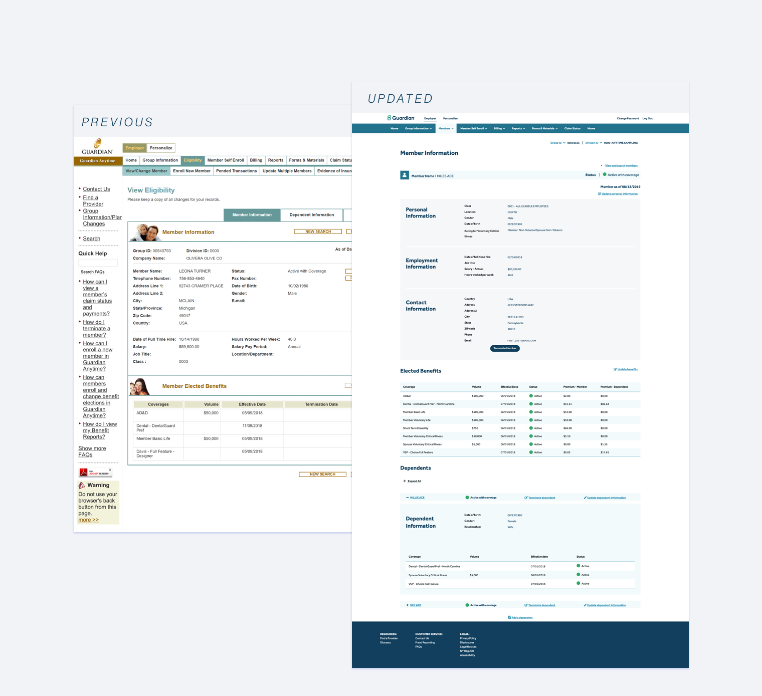
First, I conducted a heuristic evaluation of this area, and found a number of design issues, many centered on the cumbersome UI and complex, segmented layouts that taxed users’ memory load.
Recognition and Recall
On first viewing, what stands out about the site is the outdated aesthetics and lack of visual hierarchy. But further digging showed an even greater challenge with the layout of information across subpages.
The information inside the member section had been sliced up and divided among several tabs. This created several pain points for users:
users could not get a complete picture of a member on one page, but would have to dig through 3 or more sub pages
inconsistent hierarchy rules meant that users could not easily form a mental model of the section’s information architecture: one tab sorted information by member, but another by insurance type
both of the above meant a significant tax on users’ memory load, as they were forced to remember info from one section while digging through another, like a detective solving a rather uninteresting mystery
Internal User Interviews
To better understand the pain points users experienced when working with the GA Dashboard, I conducted user interviews with 7 of our CRU call center representatives. They deal daily with customers who are experiencing challenges and frustrations when using the site.
These interviews uncovered many insights on user goals and pain points:
- Plan holders’ primary reasons for coming to GA are transactional changes to their employees. For example: terminating members from their company plans is the number one use case.
- Guardian Anytime has impressive reporting functionality that is rarely used: “What a plan holder wants to do is mostly make changes to their employees, not to look at specific bills as often.”
Layout Updates
Interviews with subject matter experts revealed that the divisions of the member section were caused not by user needs or tech restrictions, but by scope creep. Features for Guardian Anytime were typically ad hoc, added because of business or customer requests but without connection to the larger dashboard ecosystem. Overtime, this made for a messy site with functionality that was often hard to find.
To untangle this mess, I started by grouping information blocks. Because there was no consistent grouping from section to section, I went with what would be strongest grouping from an employers’ point of view: Member related, benefits related, dependent related.
Compiling these three subsections into one page with a more consistent, user needs focused hierarchy should make for a far simply page with much less memory load on users. The key would be to ensure that all this info was surfaced without overwhelming users.
Ironically, one of the least useful features of the original design—accordion menus for dependents—now became essential to ensuring a balance between concision and relevance.
Subject matter experts confirmed that the dependents section was rarely viewed, as users were typically focused on enrolling and terminating employees themselves, and rarely needed to update dependent information. This meant that information from the dependent section could safely be condensed, resulting in a cleaner page.
Surfacing premium bills was more challenging. Placing member premiums inside that member’s benefits table made perfect sense, but where to place dependent premiums was more complicated.
Initially, it seemed most consistent to include dependent premiums inside each dependent’s benefits table, following the flow established by the member benefits table. the dependent failed for two reasons: tech and user priorities.
The back end system divided premiums by only two categories: “Member” or “Dependents”. This system was separate from the benefits listings themselves, meaning that new logic would have to be developed if we were to split up dependent premiums and attach them to individual dependent benefits.
However, even without this restriction, there was a user-centric reason to place dependent premiums together with member premiums. Dependent info was rarely useful to employers updating their employee’s enrollment information, with the exception of premiums.
It was safe to collapse individual dependents’ information, but employers needed to easily view all premium costs, which were typically shared in some proportion by the employer. Splitting up premiums by individual would solve one problem—locality—by retaining another one: increased mental load. In this case it was ruled best for users to be able to efficiently view premiums, even before viewing dependent information.
Design Handoff
The updated user flows and layout designs were handed off to the consultants and incorporated into the site redesign.
Consultants married the designs to the just released updated brand guidelines for Guardian digital products.
User Testing
To validate the design decisions made, I created a clickable prototype and conducted internal user tests with 2 internal groups who would be most impacted by the redesign: our call center representatives and our account managers.
These groups who work daily with customers having challenges with Guardian Anytime, and together, they form as complete a picture as is possible with internal studies.
Results
Internal usability testing with CRU validated the design for simplifying the member section and surfacing high use features. Layout updates were well received, with feedback from test subjects including:
- “I think this is great, simple and easy to follow.”
- “If it were like this in the beginning, it would have been so much better.”
- “The layout is great, it looks modern, up to date, and it’s easy, [there’s] not a lot of stuff out there [so] I don’t have to read to understand it.”
- “I don’t have to search all over the place, the info is right there, it gives me all of the options. I don’t have to look up, down, right, and left and get the name; and I can make the changes, any changes, right there.”
We also studied quantitative call center analytics in relation to feature use before, as well as several months after rollout. For the most used feature alone, there was a 22% reduction in call volume with no noticeable change in feature use.
Lessons Learned
When you don't have direct access to the users, call center representatives are a gold mine. They deal everyday with users that are experiencing frustrations and need help using your products.
Applying a brand system mid redesign is its own task. Partnering with consultants allowed them to focus on this while I worked with product managers and business teams to improve this section’s layout and functionality. The collaboration made it possible for both teams to focus on their respective areas, and ultimately increased the output for everyone.
Design must account for interdependencies and tradeoffs. Placing dependent premiums within the member benefit table could be seen as breaking the mental model, but was the right choice for balancing the needs of users looking for a quick snapshot of expenses, and devs who didn’t have the resources to create new logic