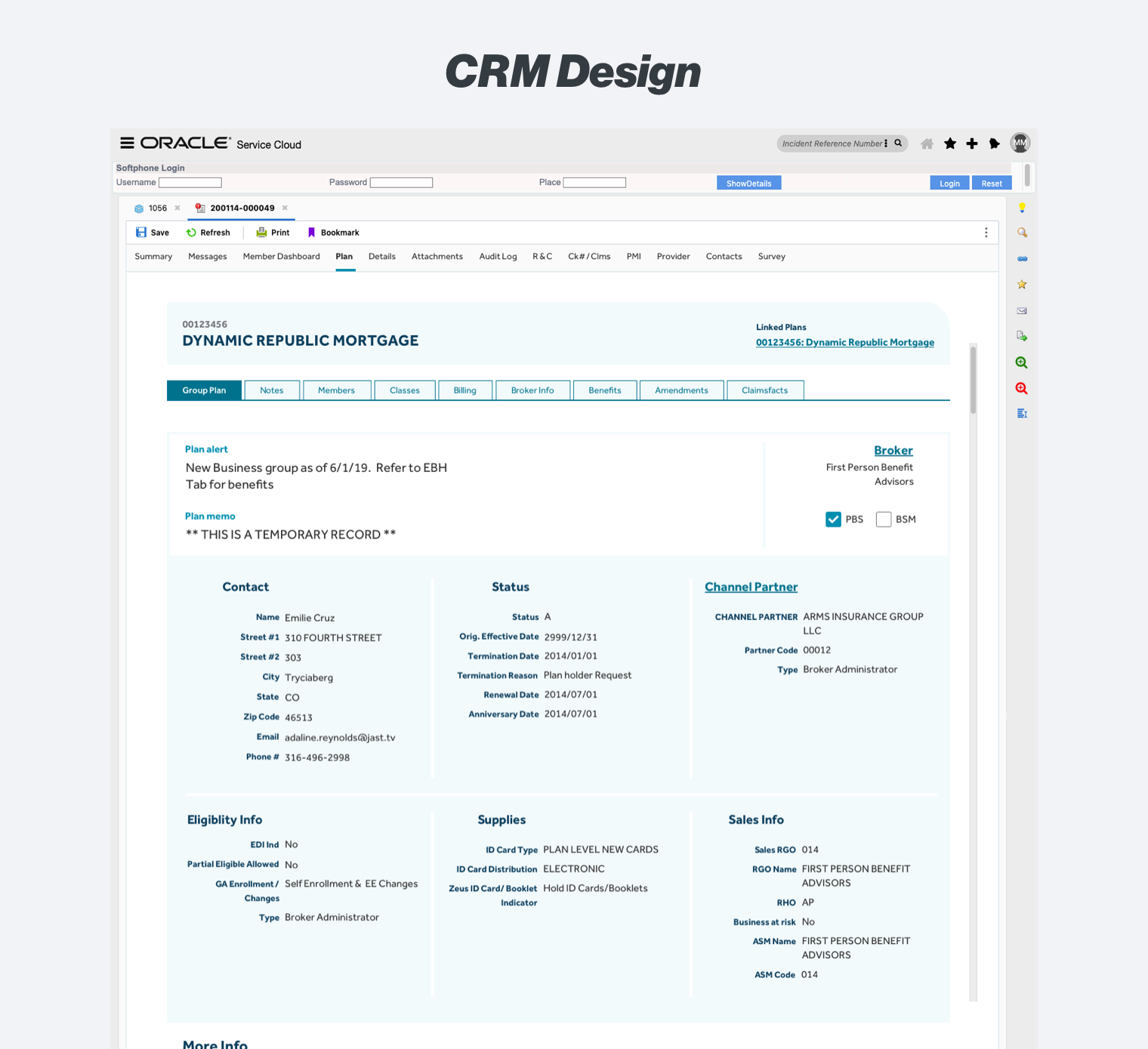
CRM Dashboard Design
For over a decade, the customer relationship management tool Siebel has been used by Guardian’s call center representatives, account service managers, sales associates and others to look up member and plan holders benefits, claims, accounts, and most other information.
The decision was made to transfer these responsibilities to Oracle Service Cloud, and I was brought on to lead the UX design of the new system's homepage, as well as it's two most challenging subpages for plan holder billing and classes.
ROLE
Solo UX Researcher & Designer
SKILLS USED
- Cross-functional collaboration
- Wireframing
- Prototyping
- Internal usability testing
TOOLS USED
- Figma
- Sketch
- InVision
- Photoshop
Problem
While no doubt efficient and well organized at its introduction, scope creep, changing needs, and siloed infrastructures had turned the system into a baffling hodgepodge of disorganized form fields inside a Byzantine information architecture.
User Needs
Initial stakeholder interviews revealed that while there were a number of internal groups that utilized Siebel, in terms of needs they could really be reduced to two user groups: call center representatives, and everyone else.
Unusual Restrictions
This project also came with a special hitch: while a UAT version of Siebel did exist, significant portions of it did not populate data:
This looks like an I Ching reading.
Fortunately, these challenges were more than offset by energetic support from collaborating subject matter experts from both the call center and non-call center user groups.
With the transition to a new system, everyone realized this was an opportunity to get a much better tool, but only if their voices were heard.
Untangling a Mess
The redesign started with the homepage. This was one of the most problematic areas because of the amount of content, and the complete disorganization of the page.
Having no previous experience with this data set or its diverse use cases, sifting through this data would have taken weeks.
Fortunately, the subject matter experts had previously completed a card sorting activity for this page.
I used this card sort as the basis for an updated layout:
Classes Section
The homepage was comparatively easy thanks to the card sorting work of the subject matter experts, but the next page required much greater attention to interaction design.
The classes section of Siebel displays data on the benefits of different groups of employees.
This section was complicated by back-end restrictions, as this data is chunked into two different servers, with some—but not complete—crossover between the two data sets. This meant that one data set would not give a complete picture of a plan, while both data sets together included significant unnecessary repetition.
The Siebel layout further complicated this by aligning the data sets into two tabs hidden inside the classes section:
The first step to solving this was to reduce the unnecessary repetition of information. With a blue sky redesign, we had the necessary resources to combine information from the two servers and remove the redundancies.
Frustratingly however, the density of this information made for a massive table:
Fear the Scroll
As a UX designer, I was concerned about the width of the table, and attempted to suggest several alternatives that would chop it down by segmenting the information into further drill downs.
The call center users were adamant that they were satisfied with one extremely long table however, and they saw it as a significant improvement over the existing 2 page version. As a designer, it did break my heart a little, but we bowed to the users’ ask!
Reining in the Sprawl
Even if it was ungainly, binding all elements of classes into one massive table was a big hit with the call center reps. However, we still needed to solve for several subfields that could be pulled up.
I was able to combine these all into one screen by bringing them up situationally and placing links to the information inside the main table instead of tucking them into sub tabs:
On to Billing
Billing was expected to be the most difficult part of the assignment, but this was where the previous iteration really paid off.
The billing area was considered especially complex because of the many different areas that could be drilled down into from the high-level view, and the nested tabs.
Where the classes table was simply too much to consolidate, with billing a combination of the previous approaches produced a solution that exceeded expectations.
Because so much of a billing data was related, such as address fields or email addresses, I was able to compile it in to two tier rows that comfortably fit on a desktop display.
Because the developers were coding with React, we had the flexibility to only display information when users called for it, making a system that was responsive to the investigatory nature of so many customer interactions:
User Testing
At this point, we had what appeared to be a robust redesign we believed would be significantly more intuitive to use, but we needed to confirm these beliefs before we set developers to work coding it, as timelines were tight and we would only get one opportunity to do this right.
I created a clickable prototype in Figma, the only tool with (free) prototyping software able to handle some of the unusual horizontal scrolling featured in the Classes section.
For this test we needed to examine both the call center representatives—our primary user group—as well as the non-call center users that would be using the tool less broadly and frequently.
I conducted usability tests with 21 users, 14 from the call center, and 7 with the non-call center representatives. There was unprecedented interest in this tool, and I actually had to turn down several volunteer participants, a situation that I've never been in before!
Tests ran for a half hour, utilizing typical call center tasks relating to the billing and classes sections, as well as getting a general impression of the homepage.
Results
The user testing broadly validated the approach to the redesign, as well as uncovering a few interaction tweaks that would be helpful for the non call center users.
Interestingly, the redesign surfaced so much functionality that it unveiled areas that users with over 10 years of experience hadn't realized existed in Siebel!
The product manager demoed the prototype I created to her stakeholders, and returned the following feedback:
“We had great feedback on the working prototype of the class screen that Matthew created. The development and his leadership during the sessions was THE key to our success in building this screen.”
The PM later demoed the working Class screen to over 100 users, mostly from non-call center areas such as Sales, Underwriting, and Claims.
She described the feedback as “overwhelmingly positive” noting “and these are some tough customers.”
Some sample quotes from that session included:
“I just had to use Siebel for a dental plan option, and I can say I cannot wait to be able to use this tool!”
“I think [it] looks GREAT. You and the team put a lot of effort into creating a great looking tool!”
“I use Siebel and mainframe a lot and I am really looking forward to using this new system. I hated having to jump between systems and this looks to be eliminating that.”
Lessons Learned
No UX designer ever succeeds on their own. There’s no substitute for subject matter experts. Because of the diversity of use cases, impenetrable layouts, and missing UAT fields, I would have been lost without their support.
Design iteration is a process, not a guarantee. When users stated their preference for massive scrolling tables, I presented three alternatives, all of which were considered, but ultimately rejected. Instead of being frustrating, this process yielded unexpected benefits when another area of the redesign benefited from those same processes.
Users come first. It killed me to go with such a massive horizontal scrolling table … but it was what users wanted! It tested well, with the vast majority approving of it. Sometimes designers need to get out of their own way and give people what they say they want.